
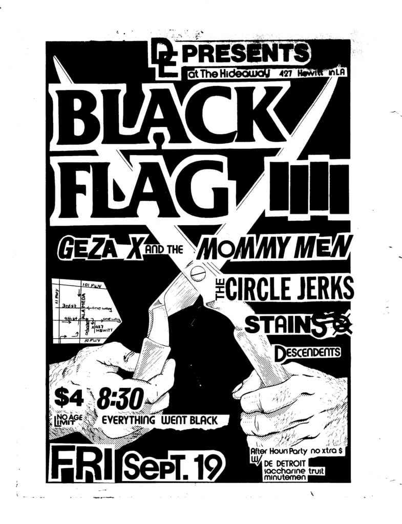
Speaking of OFF! and just end all formative things, they have Raymond Pettibon doing their art work for their album covers. Dude is a national treasure. Pettibon started out doing flyers and he logo for his brother's band Black Flag in the early eighties. I assume that he just used black and white ink and brush technique because it was cheaper to make black and white copies of the flyers, but maybe it was an aesthetic choice. Either way, his images have the most impact on me of maybe all artists.Just stark and brutal imagery with maybe a little caption to make it more disturbing. They are almost elementary in the little bit any greay or hatching of the line is used to make the images have depth. You can tell that someone made the image, and yet it doesn't take the effect away that draws the viewer in. Everything is so inherently violent and sexual. The darkness is pure black, and yet it is not quite as frightening of what lurks in the light. You can see the influence of American Romance and horror comics as well as a healthy dose of early seventies acid damaged California in there. Every on of these makes me scared of my neighbors, and maybe that is their intent.
No comments:
Post a Comment